


「基础」CSS Blend Modes 混合模式的学习与整理(下)
August 24, 2022
1 min
大家好,今天给大家分享 16个常用的自定义表单组件样式代码片段上半部分,本文尽量用最简单的CSS布局编写,对你有所启发,也许你有其他的写法,期待你在评论区的分享。
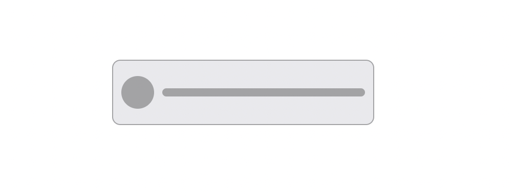
图标按钮,在设计中比较常见,示例图如下所示:
<button class="button">
    <!-- Icon -->
    ...

    <!-- Label -->
    ...
</button>
.button {
    /* Center the content */
    align-items: center;
    display: flex;
    flex-direction: row;
    justify-content: center;
}
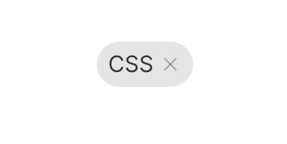
带叉号的标签,我们也会常用到,在一些博客内容网站比较常见,点击对应的标签就会看到相关的列表内容,如下图所示:
<div class="chip">
    <!-- Content -->
    <div class="chip__content">
        ...
    </div>

    <!-- The close button -->
    <!-- See https://csslayout.io/patterns/close-button -->
    ...
</div>
.chip {
    /* Center the content */
    align-items: center;
    display: inline-flex;
    justify-content: center;

    /* Background color */
    background-color: rgba(0, 0, 0, 0.1);

    /* Rounded border */
    border-radius: 9999px;

    /* Spacing */
    padding: 4px 8px;
}

.chip__content {
    margin-right: 4px;
}
原生的复选框不好看,一般我们需要进行美化,让其更适应当前的设计,如下所示:
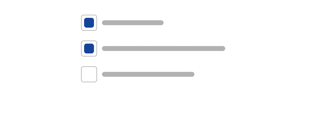
这里需要结合label 标签的使用,将其包含在内,原生的复选框默认隐藏,使用 :checked 属性,实现自定义复选框,代码如下(这里只是样式部分,选中部分需要你自行实现):
<label class="label">
    <!-- The real checkbox -->
    <input type="checkbox" class="label__input" />

    <!-- The fake square -->
    <div class="label__square">
        <!-- The inner square -->
        <div class="label__checkbox label__square--selected"></div>
    </div>

    <!-- The text -->
    ...
</div>
.label {
    /* Center the content horizontally */
    align-items: center;
    display: inline-flex;

    /* Cursor */
    cursor: pointer;
}

.label__input {
    /* Hide it */
    display: none;
}

.label__square {
    border: 1px solid rgba(0, 0, 0, 0.3);
    border-radius: 4px;

    /* Spacing */
    margin-right: 8px;
    padding: 4px;
}

.label__checkbox {
    background-color: transparent;
    border-radius: 4px;
    height: 16px;
    width: 16px;
}

.label__checkbox--selected {
    /* For selected checkbox */
    background-color: #00449e;
}
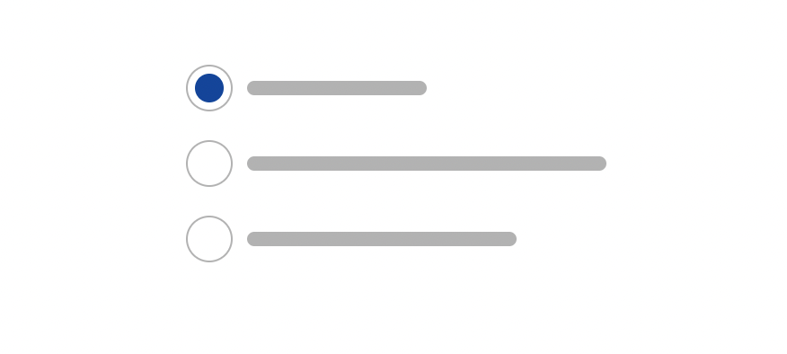
有复选框,就有自定义单选组件的需求,只能单选,不能复选,如下图所示:
<label class="label">
    <!-- The real radio -->
    <input type="radio" class="label__input" />

    <!-- The fake circle -->
    <div class="label__circle">
        <!-- The inner circle -->
        <div class="label__radio label__radio--selected"></div>
    </div>

    <!-- The text -->
    ...
</div>
.label {
    /* Center the content horizontally */
    align-items: center;
    display: inline-flex;

    /* Cursor */
    cursor: pointer;
}

.label__input {
    /* Hide it */
    display: none;
}

.label__circle {
    /* Rounded border */
    border: 1px solid rgba(0, 0, 0, 0.3);
    border-radius: 9999px;

    /* Spacing */
    margin-right: 8px;
    padding: 4px;
}

.label__radio {
    /* Rounded border */
    border-radius: 9999px;
    height: 16px;
    width: 16px;

    /* For not selected radio */
    background-color: transparent;
}

.label__radio--selected {
    /* For selected radio */
    background-color: #00449e;
}
浮动标签纸片输入框(Floating Label Paper Input)是一个具有浮动标签的表单元素组件,包括Material风格文本框、选择框和输入掩码,支持错误消息处理。如下图所示:
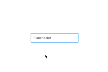
这里运用了 :not(:placeholder-shown) 两个伪类结合,:placeholder-shown 是专门用于确定元素是否显示占位符的对象,示例代码如下,使用纯 CSS 实现上图效果。
<div class="container">
    <!-- The input -->
    <input placeholder="Placeholder" class="container__input" />

    <!-- The label -->
    <label class="container__label">Placeholder</label>
</div>
.container {
    position: relative;
}

/*
Show the label at desired position when the
placeholder of input isn't shown
*/
.container__input:not(:placeholder-shown) + .container__label {
    background: #fff;
    transform: translate(0, -50%);
    opacity: 1;
}

.container__label {
    /* Position the label */
    left: 8px;
    position: absolute;
    top: 0;

    /* Hide it by default */
    opacity: 0;
    transition: all 200ms;
}
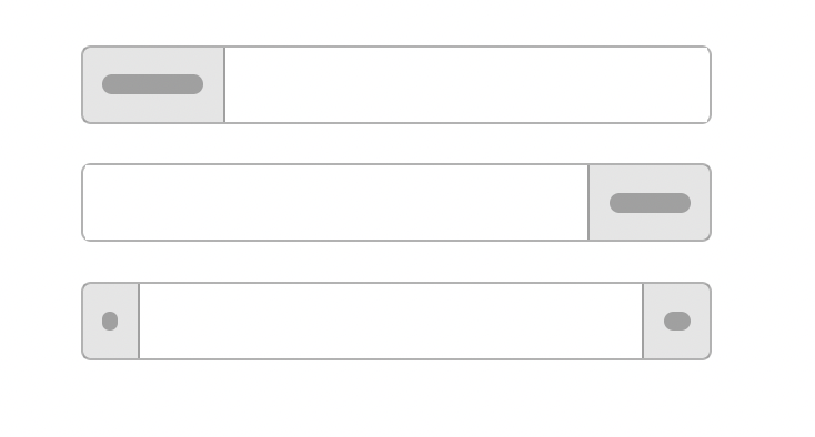
类似BootStrap组件库里,就有类似的输入框,图标和输入框并排显示,如下图所示:
<!-- Add-on prepended -->
<div class="container">
    <!-- Add-on -->
    <div class="container__addon">
        ...
    </div>

    <!-- Input -->
    <input type="text" class="container__input" />
</div>

<!-- Add-on appended -->
<div class="container">
    <!-- Input -->
    <input type="text" class="container__input" />

    <!-- Add-on -->
    <div class="container__addon">
        ...
    </div>
</div>

<!-- Appended and prepended add-ons -->
<div class="container">
    <!-- Add-on -->
    <div class="container__addon">
        ...
    </div>

    <!-- Input -->
    <input type="text" class="container__input" />

    <!-- Add-on -->
    <div class="container__addon">
        ...
    </div>
</div>
.container {
    display: flex;

    /* Take full size */
    width: 100%;
}

.container__input {
    /* Take the remaining width */
    flex: 1;
}

.container__addon {
    /* Center the content */
    align-items: center;
    display: flex;
    justify-content: center;
}
很早以前的 IOS版本 有这样单选按钮组,用来切换和显示页面,示例如下图所示:
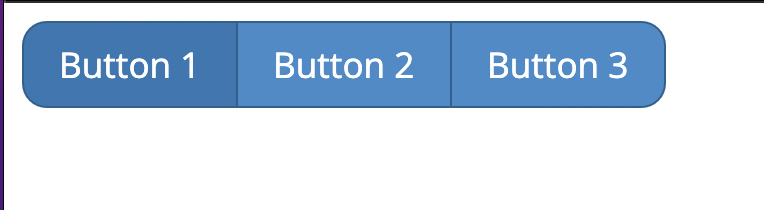
这里我们使用 radio 组件实现上述效果,示例代码如下:
<div class="stv-radio-buttons-wrapper">
    <input type="radio" class="stv-radio-button" name="radioButtonTest" value="1" id="button1" checked />
    <label for="button1">Button 1</label>
    <input type="radio" class="stv-radio-button" name="radioButtonTest" value="2" id="button2" />
    <label for="button2">Button 2</label>
    <input type="radio" class="stv-radio-button" name="radioButtonTest" value="3" id="button3" />
    <label for="button3">Button 3</label>
</div>
.stv-radio-buttons-wrapper {
  clear: both;
  display: inline-block;
}

.stv-radio-button {
  position: absolute;
  left: -9999em;
  top: -9999em;

  & + label {
    float: left;
    padding: .5em 1em;
    cursor: pointer;
    border: 1px solid #28608f;
    margin-right: -1px;
    color: #fff;
    background-color: #428bca;

    &:first-of-type {
      border-radius: .7em 0 0 .7em;
    }

    &:last-of-type {
      border-radius: 0 .7em .7em 0;
    }
  }

  &:checked + label {
    background-color: #3277b3;
  }
}
开关按钮的组件也是比较常见,在系统设置方面,会经常用到,效果如下:

<!-- Container -->
<div class="container">
    <!-- Radio container -->
    <label class="container__label container__label--selected">
        <input type="radio" class="container__input" />
        <!-- Text -->
        ...
    </label>
    <!-- Other radio item -->
    ...
</div>
.container {
    background-color: rgba(0, 0, 0, 0.1);
    border-radius: 9999px;
    display: inline-flex;
    padding: 4px;
}

.container__label {
    border-radius: 9999px;
    cursor: pointer;
    padding: 4px 8px;
}

.container__label--selected {
    /* For selected radio only */
    background-color: #357edd;
    color: #fff;
}

.container__input {
    display: none;
}
今天的文章就分享到这里,上述大部分组件都用到 :checked 伪类实现了个性化的表单组件,灵活使用,会实现意想不到的效果,下篇文章我将会分享下半部分,希望今天的分享,对你日常的业务有所帮助, 感谢你的阅读。

注:本文属于原创文章,版权属于「前端达人」公众号及 qianduandaren.com 所有,未经授权,谢绝一切形式的转载