


动手练一练,深入学习 4 个与 Hover 相关的动效案例 (上)
September 04, 2022
1 min
大家好,在上一篇文章《动手练一练,深入学习 4 个与 Hover 相关的动效案例 (上)》里我们学习了 Anchors(链接锚点)、Tooltips(提示层)动效案例,本篇文章我们继续学习
Button(按钮)、Card Content(内容卡片)。
本篇文章的两个案例,大家可以通过以下链接获取:
链接: https://pan.baidu.com/s/1nIBmEEbWcu_ZOESEZNms1Q?pwd=t81d
提取码: t81d
Button 特效是很常见的,实现起来也比较简单,今天我们要完成一个有立体特效的按钮,如下图所示:
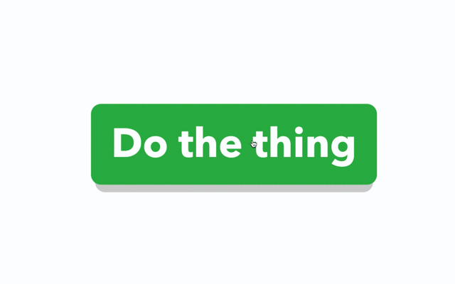
基于上面的动效图,我们来分解下动画特效:
我们先通过以下链接,在线体验下效果:
https://daren-button-hover.netlify.app/
首先,我们先布局界面,页面就一个按钮,结构比较简单,示例代码如下:
<html>
  <head>
    <title>Interactions: Level up your CSS animation skills</title>
    <!-- The default layout, resets and and text styling -->
    <link href="stylesheets/main.css" rel="stylesheet">
    <!-- Custom styling -->
    <link href="stylesheets/buttons.css" rel="stylesheet">
  </head>
  <body>
    <article class="content">
      <p><a class="button" href="#">Do the thing</a></p>
    </article>
  </body>
</html>
接下来我们来完成基础的样式 main.css ,基于 normalize.css 定义默认的相关样式:
/*! normalize.css v5.0.0 | MIT License | github.com/necolas/normalize.css */
body {
  margin: 0;
}
article, aside, footer, header, nav, section, figcaption, figure, main {
  display: block;
}
figure {
  margin: 1em 40px;
}
[hidden] {
  display: none;
}
/* Columns and layout */
* {
  box-sizing: border-box;
  -webkit-font-smoothing: antialiased;
}
/* 由于篇幅,这里省略代码 */

.content {
  -webkit-box-align: center;
      -ms-flex-align: center;
          align-items: center;
  display: -webkit-box;
  display: -ms-flexbox;
  display: flex;
  height: 100vh;
  -webkit-box-pack: center;
      -ms-flex-pack: center;
          justify-content: center;
}

p {
  font-size: 4.7em;
  max-width: 80%;
}
接下来我们新建 buttons.css 样式,定义 button 的默认样式和动画行为,首先我们来定义其默认的样式,定义 a 标签的链接为 button 样式,其定位为相对定位,使用 :before 和 :after 伪元素分别定义底部的灰色阴影和按钮的绿色背景。
 .button {
  background: none;
  position: relative;
  text-decoration: none;
}

.button::before {
  background: rgba(200,200,200,.8);
  border-radius: .25em;
    bottom: -.1em;
  content: "";
    left: .1em;
  position: absolute;
    right: .1em;
    top: .5em;
  z-index: -1;
}

.button::after {
  background: #1A9E3F;
  border-radius: .25em;
    bottom: 0;
  content: "";
    left: 0;
  position: absolute;
    right: 0;
    top: 0;
  z-index: -1;
}
接下来我们来定义:hover 相关的动画行为,让按钮经过时,按钮变大,阴影的位置往下移动,按钮的背景颜色由深绿色变成亮绿色,示例代码如下:
.button:hover {
  text-decoration: none;
          transform: scale(1.1);
}

.button:hover::before {
          transform: translateY(.1em);
}

.button:hover::after {
  background: #28B54F;
}
接下来我们来定义按钮被点击的 :active 行为动画,按钮和阴影的距离缩小,直至阴影没有,并且按钮的大小恢复至初始的大小,示例代码如下:
.button:active {
          transform: translateY(.2em);

  transition: none;
}

.button:active::before {
          transform: translateY(-.1em);
  transition: none;
}

.button, .button::before, .button::after {
  transition: all .5s cubic-bezier(0,1,.3,1);
}
到这里,本案例就介绍完了,完整的 buttons.css 代码如下:
/* Styles for the buttons */

.button {
  background: none;
  position: relative;
  text-decoration: none;
}

.button::before {
  background: rgba(200,200,200,.8);
  border-radius: .25em;
    bottom: -.1em;
  content: "";
    left: .1em;
  position: absolute;
    right: .1em;
    top: .5em;
  z-index: -1;
}

.button::after {
  background: #1A9E3F;
  border-radius: .25em;
    bottom: 0;
  content: "";
    left: 0;
  position: absolute;
    right: 0;
    top: 0;
  z-index: -1;
}

.button:hover {
  text-decoration: none;
          transform: scale(1.1);
}

.button:hover::before {
          transform: translateY(.1em);
}

.button:hover::after {
  background: #28B54F;
}

.button:active {
          transform: translateY(.2em);

  transition: none;
}

.button:active::before {
          transform: translateY(-.1em);
  transition: none;
}

.button, .button::before, .button::after {
  transition: all .5s cubic-bezier(0,1,.3,1);
}
内容卡片的动效也是一个常见的特效,尤其是在品牌宣传,广告方面的应用,鼠标经过卡片突出显示,呈现出的特效如下所示:
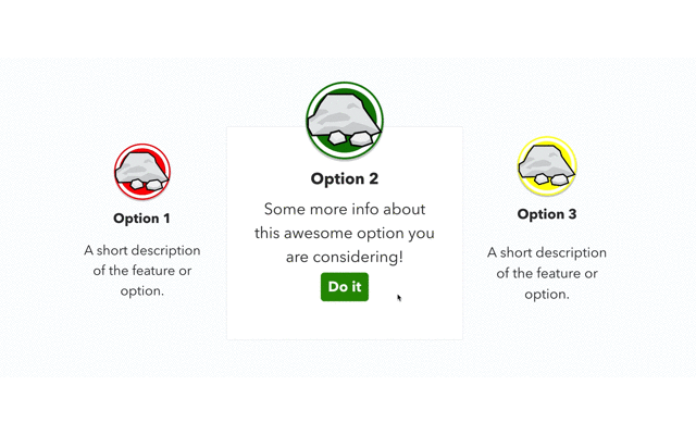
基于上面的动效图,我们来分解下动画特效:
我们可以通过以下链接,体验在线案例的xia
https://daren-content-card.netlify.app/
首先我们先完成卡片列表基础样式的布局,使用 flex 弹性布局,HTML的结构如下所示:
<html>
  <head>
    <title>Interactions: Level up your CSS animation skills</title>
    <!-- The default layout, resets and and text styling -->
    <link href="stylesheets/main.css" rel="stylesheet">
    <!-- Custom styling -->
    <link href="stylesheets/reveal-content.css" rel="stylesheet">
  </head>
  <body>
    <main class="content">
      <section class="options">
        <div class="flex-grid">
          <div class="col option">
            <div class="badge first"><img src="images/rocks.svg" class="rocky-badge"></div>
            <h2>Option 1</h2>
            <p class="summary">A short description of the feature or option.</p>
            <p class="more-info">Some more info about this awesome option you are considering!</p>
            <p class="call-to-action"><a class="button" href="https://qianduandaren.com">Do it</a></p>
          </div>
          <div class="col option highlighted featured">
            <div class="badge second"><img src="images/rocks.svg" class="rocky-badge"></div>
            <h2>Option 2</h2>
            <p class="summary">A short description of the feature or option.</p>
            <div class="show-on-hover">
              <p class="more-info">Some more info about this awesome option you are considering!</p>
              <p class="call-to-action"><a class="button" href="https://qianduandaren.com">Do it</a></p>
            </div>
          </div>
          <div class="col option">
            <div class="badge third"><img src="images/rocks.svg" class="rocky-badge"></div>
            <h2>Option 3</h2>
            <p class="summary">A short description of the feature or option.</p>
            <p class="more-info">Some more info about this awesome option you are considering!</p>
            <p class="call-to-action"><a class="button" href="https://qianduandaren.com">Do it</a></p>
          </div>
        </div>
      </section>
    </main>

    <script src="https://code.jquery.com/jquery-3.2.1.min.js" integrity="sha256-hwg4gsxgFZhOsEEamdOYGBf13FyQuiTwlAQgxVSNgt4=" crossorigin="anonymous"></script>
    <script src="./javascripts/highlight.js"></script>
  </body>
</html>
上述的代码,我们定义了 highlighted 、featured 这两个样式,我们用来定义内容卡片高亮显示的样式及默认哪个卡片高亮显示。同时为了动态的添加和移除 CSS 样式,这里我们图方便,需要借助 jquery 这个JS库。
接下来我们来完成基础的样式 main.css ,基于 normalize.css 定义默认的相关样式:
/*! normalize.css v5.0.0 | MIT License | github.com/necolas/normalize.css */
body {
  margin: 0;
}
article, aside, footer, header, nav, section, figcaption, figure, main {
  display: block;
}
figure {
  margin: 1em 40px;
}
[hidden] {
  display: none;
}
/* Columns and layout */
* {
  box-sizing: border-box;
  -webkit-font-smoothing: antialiased;
}
/* 由于篇幅,这里省略代码 */
.content {
  -webkit-box-align: center;
      -ms-flex-align: center;
          align-items: center;
  display: -webkit-box;
  display: -ms-flexbox;
  display: flex;
  height: 100vh;
  -webkit-box-pack: center;
      -ms-flex-pack: center;
          justify-content: center;
  -webkit-transform: scale(1.2);
          transform: scale(1.2);
}

.content .calls-to-action {
  display: -webkit-box;
  display: -ms-flexbox;
  display: flex;
  -webkit-box-pack: center;
      -ms-flex-pack: center;
          justify-content: center;
}
最终完成的初始化的页面布局如下图所示 :
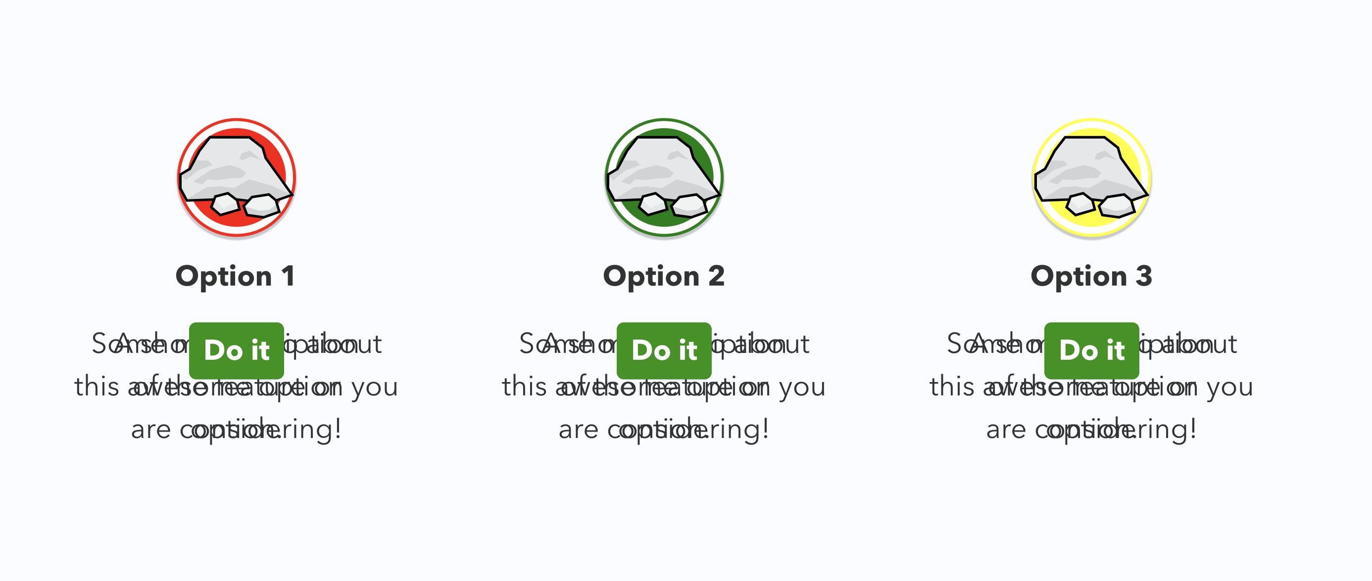
你可能注意界面有些乱,按钮和文字都重合在一起了,接下来我们新建 reveal-content.css 样式来定义动画行为相关的样式。
首先我们需要先把按钮(.call-to-action)和详细的文字内容(.more-info)隐藏起来,按钮默认缩小(鼠标经过恢复初始大小,有一种按钮逐渐变大的视觉效果),示例代码如下:
.option .more-info {
  visibility: hidden;
}

.option .call-to-action {
  transform: scale(.2);
  visibility: hidden;
}
接下来我们来定义和高亮相关的样式,示例代码如下所示:
/* 卡片默认白色背景框,灰色边框,整体变大,往下移动 1em 单位,有一种向下渐入的感觉*/
.option.highlighted {
  background: #fff;
  border-color: #eee;
  transform: scale(1.2) translateY(1em);
}
/* 图标默认由低往高提升,并且由小变大 */
.option.highlighted .badge {
          transform: translateY(-5em) scale(1.2);
}

.option.highlighted h2 {
          transform: translateY(-3.5em);
}
/* 详细文本显示,并逐渐慢慢提升的效果 */
.option.highlighted .more-info {
          transform: translateY(-4em);
  visibility: visible;
}
/* 按钮逐渐显示,并由上往下渐入的效果 */
.option.highlighted .call-to-action {
          transform: translateY(1.25em);
  visibility: visible;
}
/* 隐藏原有的文本简介 */
.option.highlighted .summary {
  visibility: hidden;
}
最后定义Transitions 让动画显得更��加平滑,示例代码如下:
.option {

  transition: transform 5s cubic-bezier(0,1.7,.3,1),
              background .2s ease-out;
}

.option > * {
  transition: transform .5s cubic-bezier(0,1,.3,1);
}
到这里 reveal-content.css 的样式就完成了,完整的代码如下所示:
/* Styles for highlighting the current hovered content area */

/* Hide the parts we'll show when highlighted */

.option .more-info {
  visibility: hidden;
}

.option .call-to-action {
          transform: scale(.2);
  visibility: hidden;
}

/* Set up the "highlighted" state */

.option.highlighted {
  background: #fff;
  border-color: #eee;
  transform: scale(1.2) translateY(1em);
}

.option.highlighted .badge {
          transform: translateY(-5em) scale(1.2);
}

.option.highlighted h2 {
          transform: translateY(-3.5em);
}

.option.highlighted .more-info {
          transform: translateY(-4em);
  visibility: visible;
}

.option.highlighted .call-to-action {
          transform: translateY(1.25em);
  visibility: visible;
}

.option.highlighted .summary {
  visibility: hidden;
}

/* Transitions */

.option {

  transition: transform 5s cubic-bezier(0,1.7,.3,1),
              background .2s ease-out;
}

.option > * {
  transition: transform .5s cubic-bezier(0,1,.3,1);
}
最后,我们使用 JS 动态的为内容卡片的鼠标经过(Hover )行为添加和移除高亮样式,没有鼠标经过行为时,根据 featured 设置,是中间的卡片恢复高亮行为 ,我们新建 highlight.js 文件 ,示例代码如下:
$(function() {

  $('.option').hover(
function() {
      $('.option').removeClass('highlighted');
      $(this).addClass('highlighted');
    },
function() {
      $(this).removeClass('highlighted');
      setTimeout(function() {
if(!$('.option.highlighted').length) {
          $('.option.featured').addClass('highlighted');
        }
      }, 500);
    }
  );

});
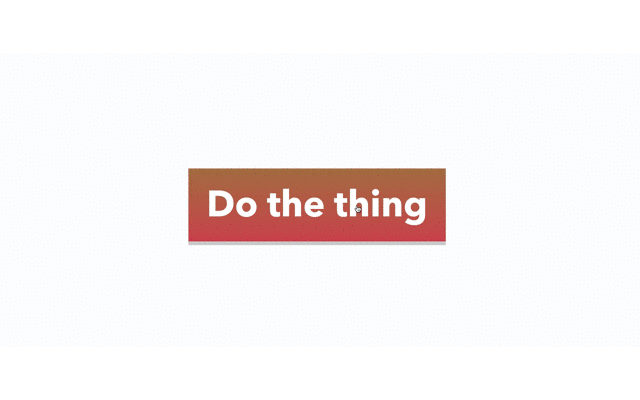
到这里,本篇文章的两个案例就介绍完了,虽然简单,但是还是要亲自尝试下动手练一练,最后给大家分享 6 个与本篇文章相关的动效案例,示例效果如下图所示:
源码下载链接:
链接: https://pan.baidu.com/s/1j4JR1nIcCr55gRUzd-S3Kg?pwd=rs7v
提取码: rs7v

注:本文属于原创文章,版权属于「前端达人」公众号及 qianduandaren.com 所有,未经授权,谢绝一切形式的转载